Optimizing SFSymbols with SVGO

Back in 2019, Apple introduced SFSymbols: a rich set of glyphs in a common style designed for developers to use in their apps. At the same time, they added the ability for developers to create their own custom symbols that would get all of the same useful behaviors as those provided by Apple. These custom symbols are defined in SVG files.

SVG is a rich format, and often includes more data than is necessary just to render an image. SVGO is currently one of the most widely-used tools for optimizing SVG files by stripping out unnecessary information. Its default configuration does a great job of making SVG files substantially smaller while still ensuring that they render correctly.

Unfortunately, using this default configuration on the SVG files used to define an SFSymbol removes the non-rendering information that Xcode relies on to create that symbol. By turning off a few of the default optimizations that SVGO provides, however, one can still use it successfully to optimize all of the SVG files in an Xcode project. (This includes both those you’re using for custom symbols and any used as regular images.) Here’s the necessary configuration to get it to work correctly:

export default {
    plugins: [
      {
        name: 'preset-default',
        params: {
          overrides: {
            // disable a default plugin
            collapseGroups: false,
            cleanupIds: false
          },
        },
      },
    ],
  };
  

If you save that to svgo-config.mjs, you can then optimize all the SVGs in your Xcode project by running svgo --multipass --config svgo-config.mjs -rf . in your project’s root directory.

A Few Articles from Mutual Mobile

Over the past year, I’ve written a few articles for Mutual Mobile that I’ve never gotten around to posting here. They’re all more or less technical, so may not be interesting if you visit for personal and family stories. If you’d like to see any of these, they’re linked here.

Accessibility: What It Is, Why It Matters, and How to Do It

I did a presentation at CocoaConf Dallas today on how, as a developer, to make your iOS apps usable by people with visual impairments. It was a lot of fun, and seemed to be well-received by the conference attendees. If you’d like to see the slides, you can download them here:

Download Accessibility Presentation

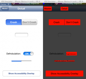
In addition, I announced an open source component I wrote to make accessibility testing easier for developers. It’s called SMAccessibilityOverlay. By adding it to an app under development, you can temporarily display an overlay that quickly shows what areas of the screen have been marked as accessible, and what labels are associated with those regions:

Accessibility Overlay Screenshot

If you’d like to try it out in your app, you can download it from GitHub here. I’d also be delighted to have input on it, either in the form of suggestions (good) or code contributions (better) or encouraging beer purchases (best).

Pebble First Impressions

I was a fairly early backer of the much-publicized Pebble smart watch. After being wristwatch-free for years, I’ve been wearing mine for nearly a week now, and have some early first impressions I thought I’d share for the curious.

First off: it’s a good-looking timepiece. While the 144×168 screen resolution sounds almost absurdly low for those of us who have been spoiled by full-color retina displays, it look just fine in context. The high-contrast display technology is great, and is visible in a wide range of conditions. Being able to turn on the backlight with a quick wrist-flick is terrific, though it does make playing hide-and-seek in the dark more challenging (as my kids will attest).

The on-device software is solid and well thought-out, with a clear, usable interface a bit reminiscent of the original iPod. Scroll views show a shadow at the top or bottom if there’s more content to display. Controlling music works like a charm with the built-in music app or any others that use Apple’s media control APIs. (Combined with Pandora and Apple TV, I can control music streaming from the Internet through my home sound system from my wrist. It’s the future!)

The included watch faces are fairly varied and interesting, with the binary display being a favorite of mine, though it takes me 10 seconds to figure out the time when someone asks me. And thanks to the support for notifications, I’ve known what those incessant chirrups coming from my phone are about without having to fish it out of my pocket.

Funnily enough, my biggest beefs with the out-of-the-box experience have to do with iOS. Pebble is taking advantage of some newer features in iOS 6 that haven’t been widely used yet, and there are still some rough edges on Apple’s side of things. Notifications have to be reset whenever the Pebble and phone lose contact with each other (which includes restarting either device, using Airplane mode, rebooting your phone for a system update, etc). Additionally, when the watch talks to the phone and the Pebble app isn’t already running in the background, iOS throws up an obtrusive alert telling you that the watch is trying to talk to the phone. It then launches the Pebble app into the foreground if you give it the permission to communicate it’s asking for.

There are, however, a few knocks I can level at the Pebble itself. If one gets multiple notifications in rapid succession — for example, when the mail app finds a few new messages in your inbox — the first notification immediately gives way to the latter, with no way to rewind and see the initial information.

The battery life doesn’t seem near as long as the advertised week. I admittedly haven’t run it into the ground yet, and I’m not 100% sure I gave it a full charge, since there’s no indication of charge status when it’s plugged in*, but so far it seems to last closer to 4 days than the week the company cites. (Oops — it just expired. Looks like the 4 day figure’s about right, and the low battery warning seems to appear 12-18 hours before it gives up the ghost.)

The most egregious problem, however, is the SDK. Or more precisely, the gaping hole where it should be. As detailed on http://www.ispebblesdkshipping.com/ (a spoof of Pebble’s own http://www.ispebbleshipping.com/), the kit that would allow developers to create new apps and watch faces for the Pebble was promised first for August 2012, then by January 23, then when the watch shipped. As of today, it still hasn’t turned up, and the company has been tight-lipped about what is causing the delay.

Given that the hardware specs have actually been improved since the Kickstarter finished, my hope is that the programmers are simply hoping to deliver something higher-quality and more capable than they’d initially planned on. The lack of communication, however, is a bit worrisome since many folks who have bought one of the devices did so out of a desire to be able to develop for it.

But overall, I’m happy with this first version of the Pebble. The existing functionality seems solid, and the possibilities for future improvements will be exciting once the SDK is finally out. If the company has to choose between putting something out soon that’s half-baked, or taking longer to create something they’re really proud of, it’s clear they choose the latter — a decision I applaud.

But now I have to go charge my watch.

* UPDATE: There actually is an indicator that lets you know when the watch is fully charged, but until the Pebble folks graciously pointed out the help page, I hadn’t been able to sort out the iconography they are using.


Going Mobile

On January 2, I”ll be going to work for Mutual Mobile, an Austin-based company that specializes in application development for iOS, Android and Blackberry devices.

“But Sean!” I hear you, Rhetorically Convenient Reader, cry. “You just started working for Magnolia back in March! Why are you moving on again so soon?” That’s a good question. It doesn’t have anything to do with Magnolia: it’s a terrific company, filled with great people that I am glad to call coworkers and friends. That fact made this decision especially hard, as I knew I’d be seeing less of these people I quite like (and would, honestly, be making their lives tougher in the short term with my departure).

But as much as I like Magnolia, the nature of their business means that my work there revolved around two things: Java and Sales. Java is an industry standard for creating software of various stripes, but it’s a very buttoned-down, staid environment to work in. It lacks the creative energy and — is it silly to say this? — joy that I see in the communities that exist around some of the more dynamic, less-widely used languages like Ruby and Python and Lisp (for you AI wonks out there). I can get work done in it just fine, but the number of times a spontaneous “Awesome!” escapes my lips while doing so is vanishingly small.

The other focus of my last 9 months has been selling Magnolia to various companies. I think the software is a phenomenal piece of work, and really well-suited to a whole variety of Web Content Management scenarios. But while I can do an effective job helping to demonstrate and sell it, there’s no frisson associated with doing so for me.

I like technology for what it can do for people. I like creating it because doing so is much like fashioning a beautiful, intricate bit of clockwork, or a complex bit of musical counterpoint. There is immense satisfaction in creating something that works elegantly and beautifully. Unfortunately, telling people about how terrific other people’s work is provides very little of the satisfaction that actually doing that creative work oneself. If I’m going to be in the technology world, I want to make cool stuff for normal people, not to sell cool technology to corporations.

So, Mutual Mobile. I’ll be starting there as an iOS Manager, which means that not only will I be getting to work directly on creating some great stuff for their impressive list of clients, but I’ll also be getting to help figure out the best way to help the other developers there do their best work as well. I’ll be hanging around a bunch of really smart folks, and will doubtless be learning tons about iPhone development and other mobile disciplines. The company seems like a marvelous place to hang one’s professional hat — a vibrant company culture, entirely self-funded with no investor money involved, just named by Forbes as one of America’s most promising companies, and has its company meetings at the Alamo Drafthouse, one of my favorite places in Austin. And the downside of facing a commute again is largely ameliorated by the fact that Texas State University runs a shuttle bus from San Marcos with wireless Internet to a park 4 blocks away from the office. Sweet!

I’m excited about this next adventure, and will be posting more about it once I’ve got my feet under me. Wish me luck!

Ditching Titanium

Back in March, I posted my Thoughts on Titanium, which we were using at the time to develop Texas State’s iPhone application. Since that time, we’ve become increasingly frustrated with the system, and have finally decided to leave it behind and rewrite the application in a combination of native Objective C code and HTML/CSS/Javascript.

This isn’t a decision we made lightly. I actually resisted it for a number of months, even when some of the other developers on my team were lobbying pretty strongly for it. The promise of Titanium, which allows developers to use Javascript to create native applications for iPhone and Android platforms, was great. Unfortunately, it has never lived up to that promise for us.

The first reason we decided to leave it behind was Apple’s Developer Program License Agreement. When iPhone 4.0 was released, the Agreement was amended to prohibit using intermediary layers like Titanium. The folks at Appcelerator quickly moved to quell their customers’ fears, pointing out that Apple was still approving Titanium-made applications. While it is true that Apple hasn’t lowered the boom yet, these apps still violate the letter of the agreement, and could therefore be pulled from the App Store at Apple’s whim. Further, when RunRev, a company that creates a development tool similar to Titanium, tried to reach an official understanding with Apple, Steve Jobs made it very clear that Apple wasn’t interested. Given this level of hostility to other development tools, staying with Titanium would obviously increase the risk that we’d run afoul of Apple in the future.

The second, and more important, reason was this: Titanium’s engineering is just not good enough for our purposes. It works great for small-scale projects that people want to get done quickly. But as we have tried to build large-scale projects, we have repeatedly run into problems that we would spend hours trying to solve, only to find that there was an issue in Titanium’s code that we couldn’t work around. New versions of the software would cause portions of our code that had worked fine before to stop functioning. Version 1.4 of their framework was released well over a month after they had originally promised it.

As one of the programmers on my team put it: “When I work in [another development environment], I’m 99% sure that any problems I have in my program are because I’m doing something wrong. With Titanium, I’m only about 50% sure.”

To be sure, the folks at Appcelerator have taken on a huge technical challenge, have ramped up quickly, and are working as hard as can be to make their product feature-rich. But after months of frustration, we’re not willing to keep investing in a system that keeps us so far from our programming happy place. Objective C, here we come!

Why the iPhone is the Best Camera Ever

Back in the early days of digital cameras, I bought a Kodak DC220 camera. By today’s standards, this camera is wholly unremarkable: 1MP resolution, 2x optical zoom, and a funny shape. But it had one feature that stood out, and which modern cameras entirely lack: a scripting language. Anybody with a modicum of technical acumen could actually write programs for this camera, enabling it to do motion detection, exposure bracketing, various special effects, etc. More ambitious users even implemented games for it, allowing one to play Pac Man while waiting for that perfect shot.

When I last went camera shopping, I tried to find another camera that allowed programming, as I’m forever wanting to try different things while capturing images. But there was absolutely nothing available. I could get cameras with built-in wifi, GPS, a bevy of image processing modes, but nothing that actually allowed me to write your my programs to tell the camera how to behave.

(I would be remiss not to mention CHDK, an alternate open-source firmware for many Canon cameras that allows one to do all kinds of crazy stuff with them, including writing your own scripts. It’s awesomely capable, but lacks the refinement and ease-of-use that make it possible to pick up the camera and just use it. For everyday picture taking tasks, it actually makes the camera more difficult to use, in my experience.)

Enter the iPhone. From a feature standpoint, it’s not especially notable as a camera: 3MP, no flash, no zoom, odd form factor (for a camera). But the thing that sets it apart is its programability and connectivity. One can download apps to provide all kinds of interesting photo-related functionality: panorama stitching, photo-a-day applications, film camera simulations, various specialized effects, retouching tools, and even “Pimple FacePaint”, which lets you add blemishes to portraits. (There’s a market for that?)

Add that customizability to its communication capabilities, which allow one to share and upload images right from the device without bothering with cables, and you have an unparalleled platform for creating and distributing photos. With a traditional camera, for example, to take a panorama, I would have to shoot each of the images, hoping I got them framed correctly, then download them to the computer, then stitch them together, then upload them to a photo sharing service. On the iPhone, I can do all of those things from one app on one device. (And have the image automatically geotagged, since the iPhone has GPS built in.)

There are certainly still situations where it doesn’t make sense. If you need high-resolution imagery for printing enlargements, you’re out of luck. If you need a flash, ditto. If you are shooting from a distance, you’d be better off with something that has a zoom lens. But for day to day photo taking and experimenting with creative techniques, there’s nothing out there that can beat it today. And the recently announced iPhone 4, with its LED flash and higher resolution image sensor, only stands to make it better.

Postscript: no, I don’t have one, and won’t get one until the usurious data fees get lower or I get markedly richer.

Texas State iPhone App Released

At long last, the official Texas State University iPhone App is released!

The team brainstormed and prototyped the original version as a learning exercise at the beginning of the year, but once Marketing got wind of it, it quickly became a high-priority project. I’m really proud of my crew, who have all stepped up and contributed design ideas and code to the final product, which turned out really well.

We have some ideas for improving it going forward, and have plans to create an Android version as well, but are, for now, just delighted to finally have it out there in the world!